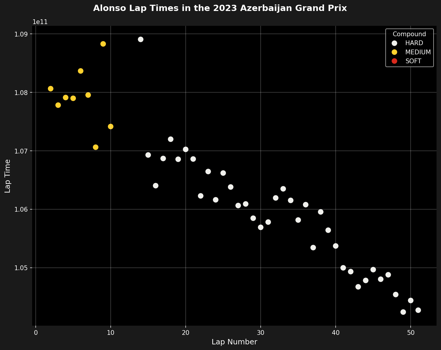
This tutorial shows how to create a scatter plot of a driver’s lap times throughout a race, with color coding based on tire compounds used. This visualization helps identify tire performance, consistency, and strategy effectiveness.
Setup
import tif1
import seaborn as sns
import matplotlib.pyplot as plt

# Enable Matplotlib patches for plotting timedelta values and load
# tif1's dark color scheme
tif1.plotting.setup_mpl(mpl_timedelta_support=True, color_scheme='fastf1')
Load the Race Session
# Load the race session
race = tif1.get_session(2023, "Azerbaijan", 'R')
laps = race.laps
Get Driver Laps
Filter laps for a specific driver and remove slow laps that would distort the visualization.
# Get all laps for a single driver
# Filter out slow laps as they distort the graph axis
driver_laps = laps[laps["Driver"] == "ALO"].copy()

# Remove slow laps (pit laps, safety car, etc.)
# Keep only laps within 107% of the driver's fastest lap
fastest_lap = driver_laps["LapTime"].min()
driver_laps = driver_laps[driver_laps["LapTime"] < fastest_lap * 1.07]

# Remove deleted/invalid laps
driver_laps = driver_laps[~driver_laps["Deleted"]]

# Reset index for cleaner plotting
driver_laps = driver_laps.reset_index(drop=True)
Create the Scatter Plot
Make a scatter plot using lap number as the x-axis and lap time as the y-axis. Marker colors correspond to the tire compounds used.
fig, ax = plt.subplots(figsize=(10, 8))

# Create scatter plot with compound-based coloring
sns.scatterplot(
    data=driver_laps,
    x="LapNumber",
    y="LapTime",
    ax=ax,
    hue="Compound",
    palette=tif1.plotting.get_compound_mapping(session=race),
    s=80,
    linewidth=0,
    legend='auto'
)
Enhance the Plot
Make the plot more aesthetic and easier to read.
# Set axis labels
ax.set_xlabel("Lap Number", fontsize=12)
ax.set_ylabel("Lap Time", fontsize=12)

# The y-axis increases from bottom to top by default
# Since we are plotting time, it makes sense to invert the axis
ax.invert_yaxis()

# Add title
plt.suptitle("Alonso Lap Times in the 2023 Azerbaijan Grand Prix",
             fontsize=14, fontweight='bold')

# Turn on major grid lines
plt.grid(color='w', which='major', axis='both', alpha=0.3)

# Remove spines for cleaner look
sns.despine(left=True, bottom=True)

plt.tight_layout()
plt.show()
Complete Example
Here’s the full code in one block:
import tif1
import seaborn as sns
import matplotlib.pyplot as plt

# Setup plotting
tif1.plotting.setup_mpl(mpl_timedelta_support=True, color_scheme='fastf1')

# Load race session
race = tif1.get_session(2023, "Azerbaijan", 'R')
laps = race.laps

# Get driver laps and filter
driver_laps = laps[laps["Driver"] == "ALO"].copy()
fastest_lap = driver_laps["LapTime"].min()
driver_laps = driver_laps[driver_laps["LapTime"] < fastest_lap * 1.07]
driver_laps = driver_laps[~driver_laps["Deleted"]].reset_index(drop=True)

# Create scatter plot
fig, ax = plt.subplots(figsize=(10, 8))

sns.scatterplot(
    data=driver_laps,
    x="LapNumber",
    y="LapTime",
    ax=ax,
    hue="Compound",
    palette=tif1.plotting.get_compound_mapping(session=race),
    s=80,
    linewidth=0,
    legend='auto'
)

# Enhance plot
ax.set_xlabel("Lap Number", fontsize=12)
ax.set_ylabel("Lap Time", fontsize=12)
ax.invert_yaxis()
plt.suptitle("Alonso Lap Times in the 2023 Azerbaijan Grand Prix",
             fontsize=14, fontweight='bold')
plt.grid(color='w', which='major', axis='both', alpha=0.3)
sns.despine(left=True, bottom=True)

plt.tight_layout()
plt.show()
Analyzing Multiple Drivers
You can extend this to compare multiple drivers side by side:
# Compare top 3 finishers
final_lap = laps[laps["LapNumber"] == laps["LapNumber"].max()]
top_3_drivers = final_lap.sort_values("Position").head(3)["Driver"].tolist()

fig, axes = plt.subplots(1, 3, figsize=(18, 6), sharey=True)

for idx, driver in enumerate(top_3_drivers):
    ax = axes[idx]

    # Filter driver laps
    driver_laps = laps[laps["Driver"] == driver].copy()
    fastest_lap = driver_laps["LapTime"].min()
    driver_laps = driver_laps[driver_laps["LapTime"] < fastest_lap * 1.07]
    driver_laps = driver_laps[~driver_laps["Deleted"]]

    # Plot
    sns.scatterplot(
        data=driver_laps,
        x="LapNumber",
        y="LapTime",
        ax=ax,
        hue="Compound",
        palette=tif1.plotting.get_compound_mapping(session=race),
        s=60,
        linewidth=0,
        legend=(idx == 2)  # Only show legend on last plot
    )

    ax.set_xlabel("Lap Number")
    ax.set_ylabel("Lap Time" if idx == 0 else "")
    ax.set_title(f"{driver}", fontweight='bold')
    ax.invert_yaxis()
    ax.grid(color='w', which='major', axis='both', alpha=0.3)
    sns.despine(left=True, bottom=True, ax=ax)

plt.suptitle("Top 3 Finishers - Lap Time Comparison",
             fontsize=16, fontweight='bold', y=1.02)
plt.tight_layout()
plt.show()
Insights from the Visualization
This type of plot reveals several key insights:
- Tire Performance: Different compounds show distinct lap time clusters
- Degradation: Upward trends within a compound indicate tire wear
- Consistency: Tight clustering shows consistent driving
- Strategy: Compound changes and their timing are clearly visible
- Outliers: Slow laps (traffic, mistakes) stand out immediately
Customization Options
You can customize the plot further:
# Use custom colors
custom_palette = {
    "SOFT": "#FF0000",
    "MEDIUM": "#FFA500",
    "HARD": "#FFFFFF",
    "INTERMEDIATE": "#00FF00",
    "WET": "#0000FF"
}

# Adjust marker size and style
sns.scatterplot(
    data=driver_laps,
    x="LapNumber",
    y="LapTime",
    hue="Compound",
    palette=custom_palette,
    s=100,  # Larger markers
    marker='D',  # Diamond markers
    alpha=0.7,  # Transparency
    edgecolor='black',  # Marker outline
    linewidth=0.5
)
Summary
This tutorial demonstrated how to create an effective lap time visualization that combines temporal data (lap number) with performance data (lap time) and strategic information (tire compound). The scatter plot format makes it easy to spot patterns, outliers, and strategic decisions throughout a race.
Related Pages
Tire Strategy
Detailed tire analysis
Race Pace Analysis
Compare race pace
Plotting API
Plotting reference
Complete Race Analysis
Full race workflow
Last modified on March 6, 2026